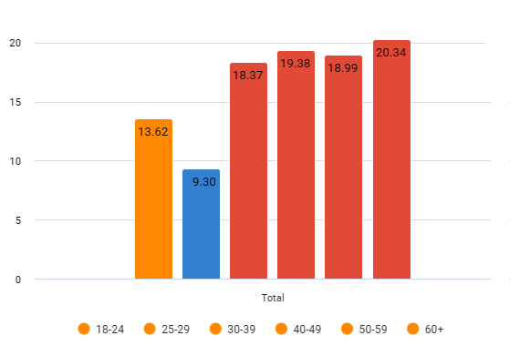
In a crosstab, you can calculate and visualize statistical significance indicators, which can be displayed in either tables or charts. Statistical significance settings are available in both the crosstab interface and on dashboards.
To highlight meaningful changes over time and create more reliable trend reports, you can add statistical significance testing to a crosstab by clicking the Significance (Sgn) button in the metrics toolbar. Significance testing helps distinguish real differences in the data from those that may have occurred by chance, making it easier to identify trends and draw confident conclusions.
Comparison settings
Significance settings can be configured globally at the project level and are applied automatically whenever significance indication is enabled. However, if you use the Comparison settings directly from a crosstab or dashboard, indication style will override the global settings for that specific visualization only. If you want to maintain a consistent appearance and significance behavior across the entire project, we recommend configuring colors and indications in the global settings.
To manage Comparison settings, click on the down arrow next to the 'Sgn' button and open the Comparison pop-up:
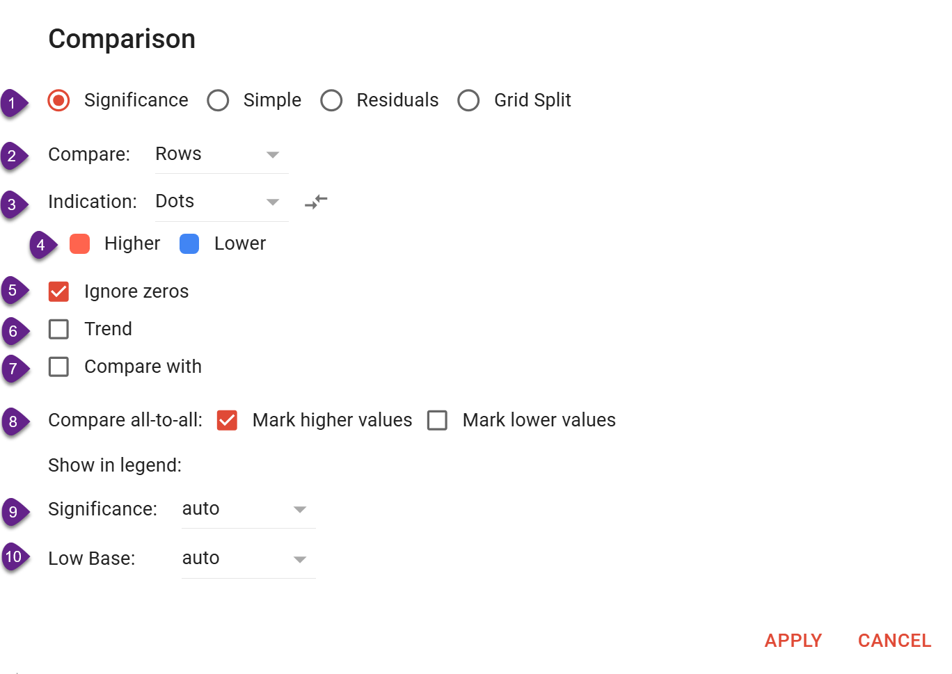
The Comparison window allows you to configure how statistical significance is calculated and displayed.
-
Comparison method
Select the required comparison mode:-
Significance
-
Simple
-
Residuals
-
Grid Split
-
-
Compare
Choose whether values should be compared across rows or columns. -
The indication section lets you select different indicator types (see details below).
-
Color pickers for Higher / Lower indicators
By clicking the colorful icon, you can select colors to indicate statistically significant values above and below the significance level.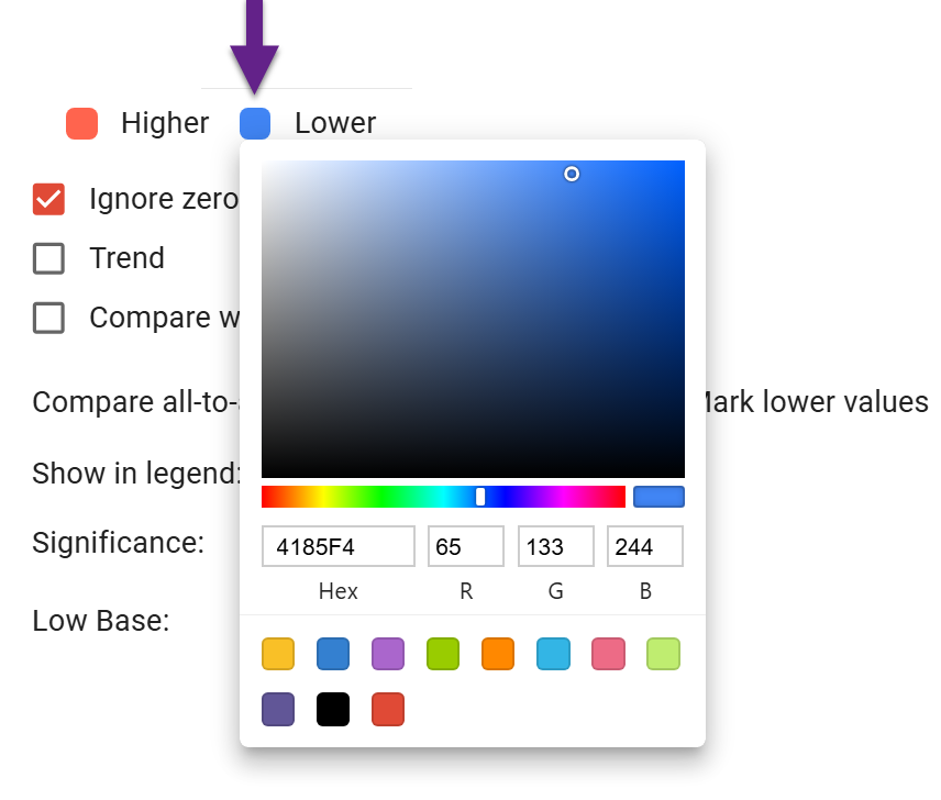
-
Ignore zeros
Exclude zero values from significance comparisons. -
Trend
Enable significance testing for ordered comparisons, such as changes between consecutive periods in a trend report. If you need to compare data not with the previous, but with the earlier period, tick the ‘Trend’ checkbox and make a bigger shift (2, 3, or more). -
Compare with
Select a specific row or column to use as the reference for comparison. -
Compare all-to-all
Compare all values with one another. In case of all-to-all comparison, you can choose whether to:-
mark higher values;
-
mark lower values.
-
-
Significance
Set the statistical significance threshold. The auto option applies the default project settings. -
Low Base
Define the low-base threshold below which significance results should not be displayed. The auto option uses the default project settings.
Significance indicators
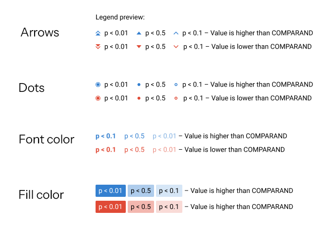
You can choose the following types of significance indication:
-
Arrows - different sizes of arrows depending on the threshold next to the text in the cell;
-
Dots - different sizes of dots depending on the threshold next to the text in the cell;
-
Font color - the text in the cell has a color;
-
Fill color - the entire cell is filled with color;
-
Chart color - coloring of chart segments. Available not for every chart type. Here is an example of how it looks for the bar charts: