On dashboards, you can enable titles and descriptions for specific widgets and customize them using font settings and layouts.
Chart widget labels (titles)
There are three
-
Title;
-
Description;
-
Filter.
In EDIT mode, select the chart widget, open the ‘Titles’ menu, and mark the needed options to enable the labels.
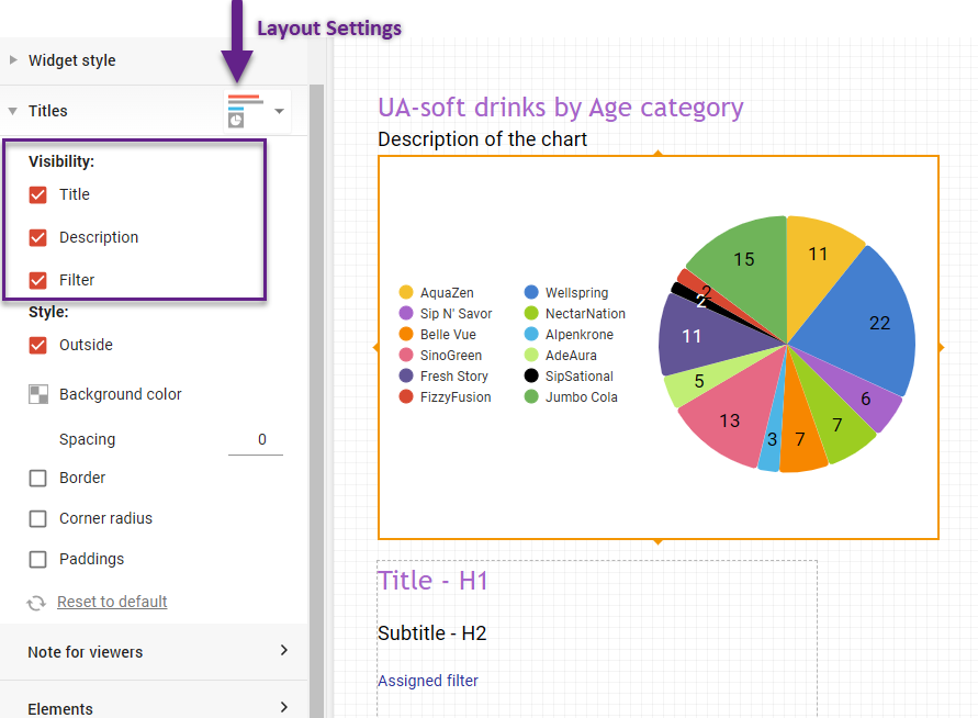
The titles' positions are set according to the selected layout. The layout dropdown list is positioned at the top of the Titles menu. It has 9 options as shown below. Using color coding, the main title is shown with a red line, the description with a gray line, and the filter with a blue line.
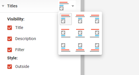
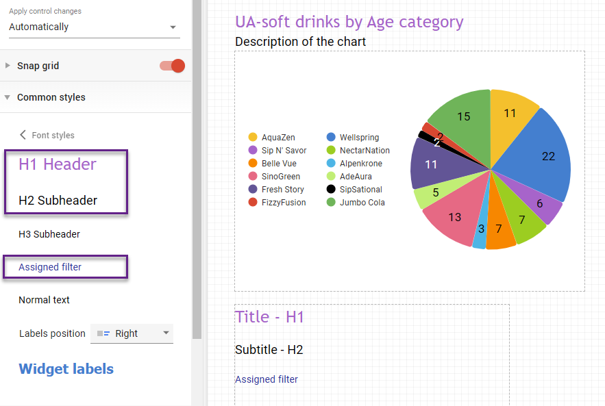
Chart label font settings utilize the font styles set in the common styles menu.
The Common styles settings apply consistently across the entire dashboard rather than to individual charts.
To open this menu, make sure no widgets are selected. Then go to Common styles → Font styles, where you can adjust the font settings:
-
The H1 Header font style defines the Title font.
-
The H2 Subheader font style defines the Description font.
-
The assigned filter font style defines the Filter font.
Headers
If none of the standard layouts fit your needs and you want to position chart labels separately, you can use Headers.
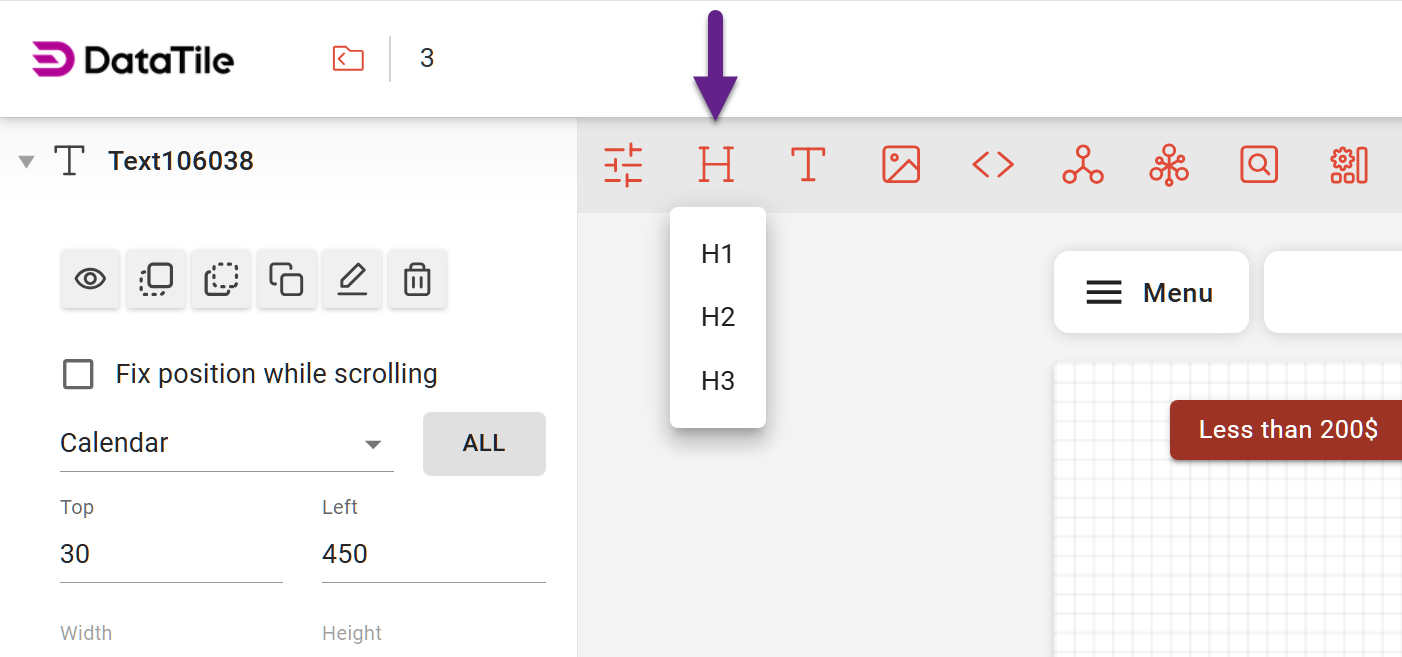
These are separate text blocks that are also controlled by the Common Styles settings. The H1 Header, H2 subheader, and H3 subheader font settings define the styles for H1, H2, and H3 headers, respectively.
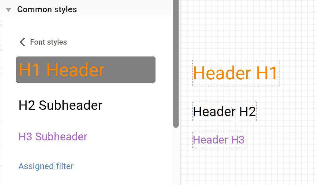
You can freely move each header across the dashboard and place it wherever needed.
Control title
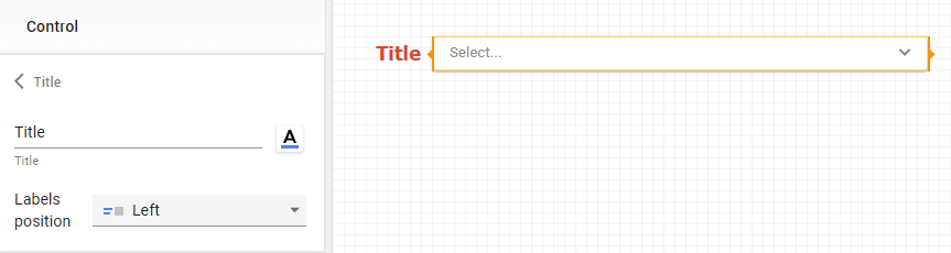
The control title is a separate text block with its own settings menu.
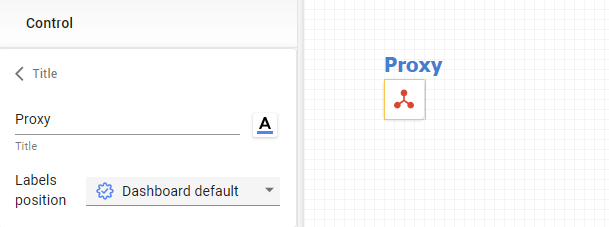
Select a control, then navigate to Control → Title in the left menu panel. Here, you can enter the text, adjust font settings, and set the title position.
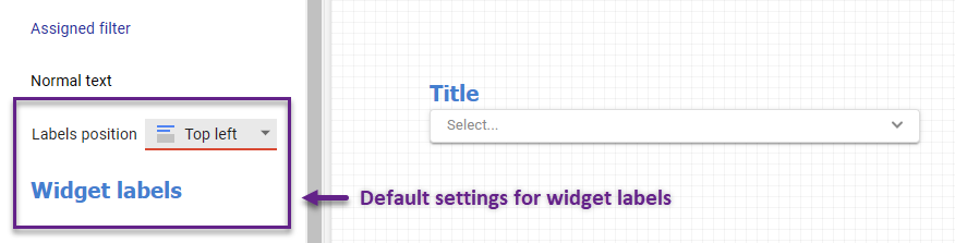
If nothing is adjusted here, the default dashboard settings will be applied. The default settings for the control title are defined by the widget label setting in the common styles menu.
Similar to controls, the proxy control title and the comparison toggle button share the default settings from the common style and also include a separate menu for custom configurations.