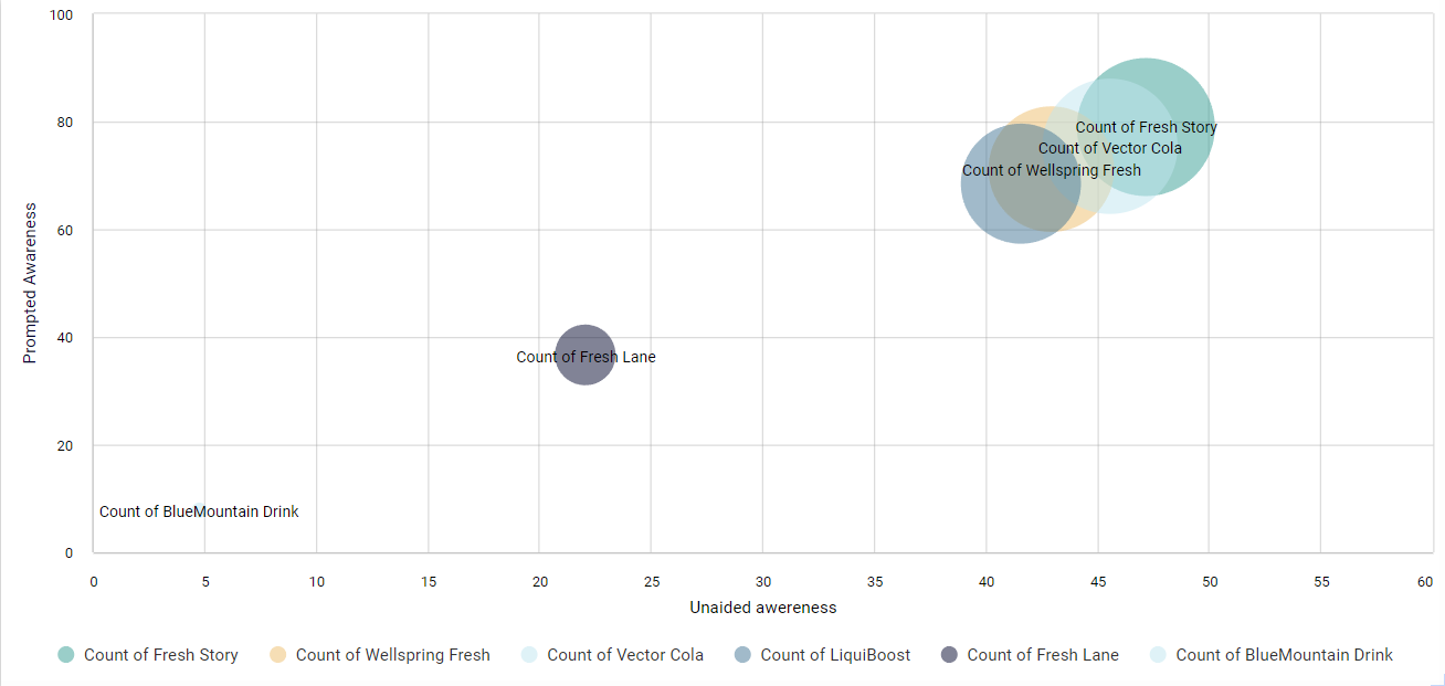
Scatter plots are used to display the relationship between two different variables by plotting data points on horizontal and vertical axes. You can also add a third variable to control the size of the data points in the chart.
Create the Scatter plot
-
Open your database.
-
Switch to GRID report.
-
Click and drag two or more variables and drop them on the columns ‘as-variable’.
-
Click Calculate.
-
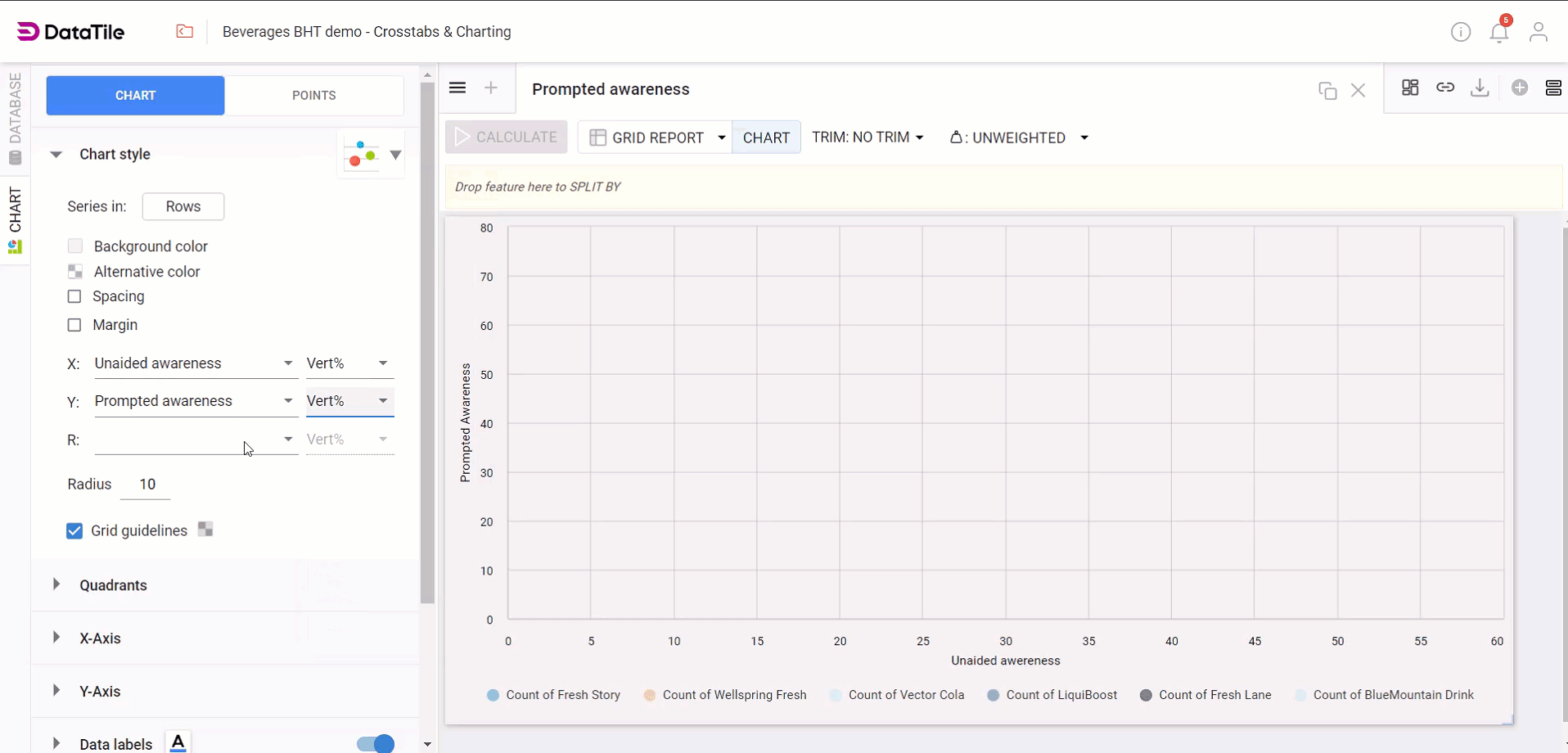
Click CHART in the toolbar to enter chart mode.
-
Select the CHART Type icon and select Scatter plot.
Scatter plot Settings
All the Chart Settings are shown in the pane on the left-hand side of the screen, the menu can change depending on what type of chart you are working on.
Chart Style Settings
-
Select Chart Style to expand the options.
-
Choose which variable will populate the X or Y axis. For a third variable, choose the R variable (the data that calculates the radius of the bubbles).
-
Under Radius scaling, select Linear and change the Max range to 100. The bubbles will now change size according to the size of the brand.
-
To choose the Background color of the chart, click the box and select a color. Likewise, you can choose an ‘alternative color’ as a secondary background color for your chart.
-
The Spacing allows you to set indents from the window edge to the chart content - tick the checkbox and set the number of pixels.
Quadrants
-
Quadrants are sections that divide the chart into four equal parts, typically using the midpoint of the X and Y axes as the dividing lines. Each quadrant represents a different combination of high and low values for the variables on the axes.
X and Y axis Settings
-
Sets the Scale between tick marks or grid lines on the axis.
-
Add titles to the axes, such as 'Unprompted Awareness' or 'Prompted Awareness.' Vary the sizes and colors of the titles.
-
Vary the sizes and colors of the labels. If needed, add suffixes and prefixes to labels.
Data Labels
-
Click on Data Labels to enlarge the menu.
-
Select the checkbox for Show data markers to display values for each bubble.
-
Change Position labels to the left, center, or right horizontally, and to the top, middle, or bottom vertically.