
A new type of interaction for charts on dashboards is the source chart. This chart is designed to simultaneously replace the options on the axes of the linked charts, following the ‘Put On’ principle.
Creating one chart with certain options, you can assign it to many others as ‘Source’. In this way, by adjusting the options of a single chart (such as masking, trimming, etc.), you can simultaneously apply those changes to multiple other charts.
You can choose how to transfer options:
-
row to row,
-
row to column,
-
column to column,
-
column to row.
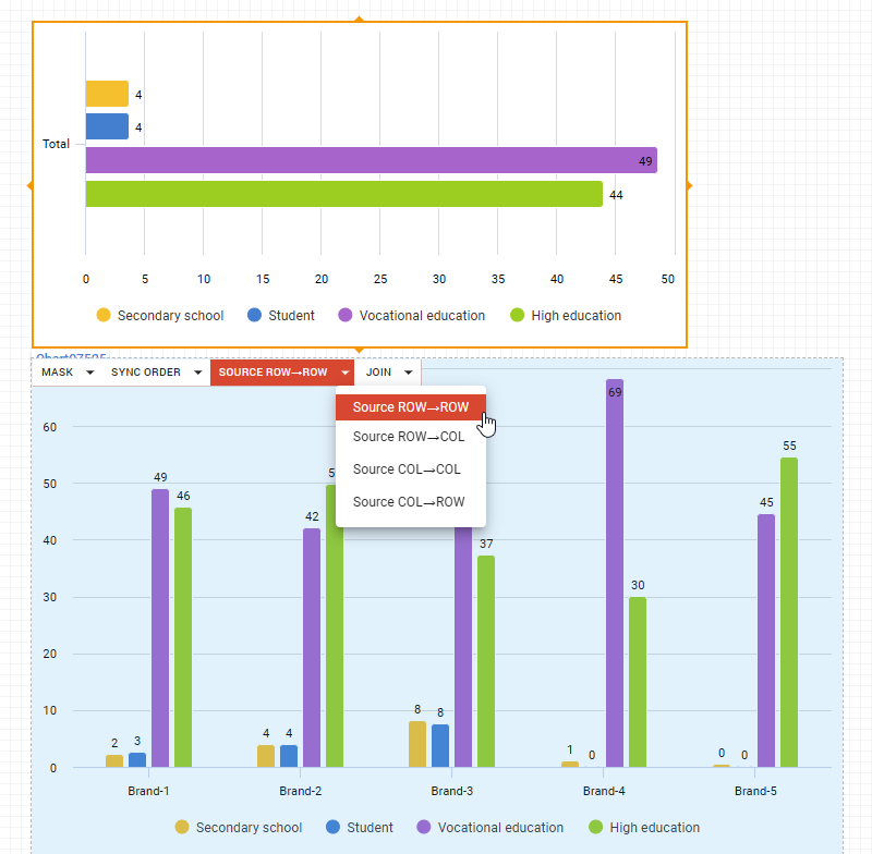
You can assign a chart as a source for an unlimited number of other charts.
The key advantages of this feature include a significant reduction in time and resources for chart synchronization, minimizing the number of controls, and eliminating the risk of human error.
Here is an example of how it works when the source chart is masked.