
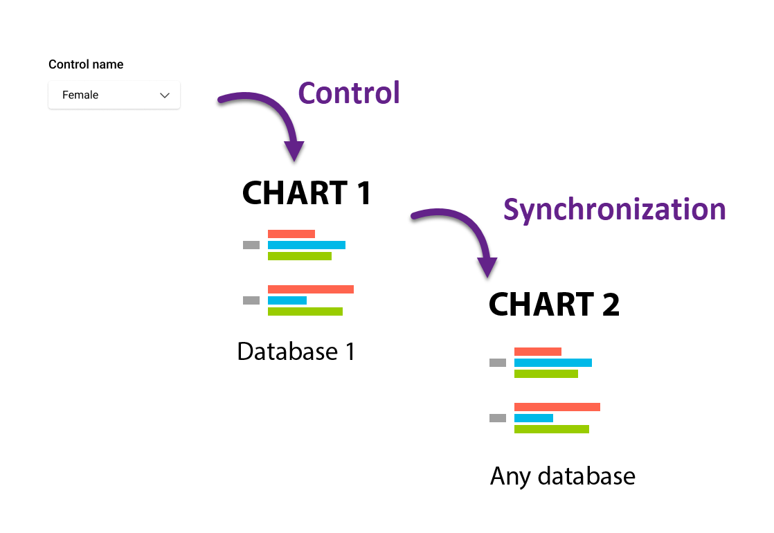
In addition to masking and source, charts on a dashboard can also interact through synchronization.
With this interaction, the categories on the selected axis of the dependent chart are reordered to match the corresponding categories in the controlling chart. Unlike masking, categories not presented in the controlling chart remain visible and are stacked after the synchronized ones.
To synchronize charts on a dashboard
-
Select the controlling chart. Available interaction options will then appear in the menu panels of other charts.
-
On the dependent chart, choose the Sync order option and select the masking direction. Any axis of the controlling chart can be used to mask any axis of the dependent chart.
Sync order is a label-based operation. For it to work, labels must match exactly between the controlling and dependent charts.
Synchronization is particularly useful for charts based on mathematical calculations, where the order of operations may prevent direct sorting. In such cases, synchronization provides an easy way to align category order across charts.
Another common use case is synchronizing different axes. This is useful when the dependent chart cannot simply swap rows and columns without affecting the correctness of the calculated metrics.