
Dashboards support several types of chart interactions, including source, synchronization, and masking.
Masking allows you to control the visibility of series in one chart using another chart, which is itself controlled by a dashboard control. This interaction reduces the number of controls required on a dashboard, helps maintain a consistent visualization, and enables linking charts with different variable sets, even when they are built on different datasets.
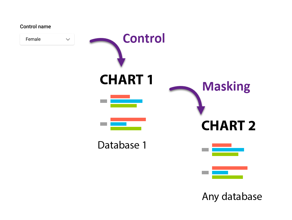
Masking is a label-based operation. For masking to work, labels must match exactly between the controlling and dependent charts.
To mask one chart with another
-
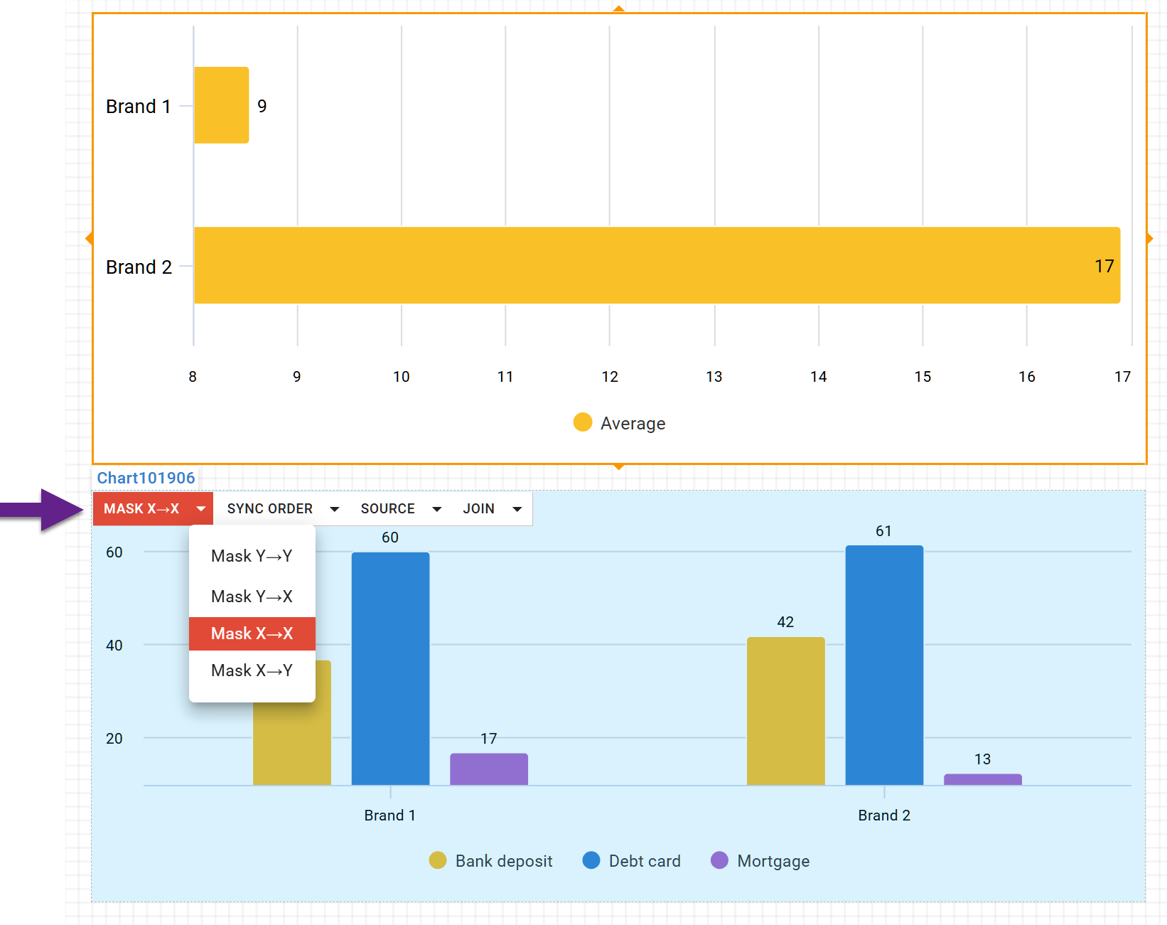
Select the controlling chart. Available interaction options will then appear in the menu panels of other charts.
-
On the dependent chart, choose the Masking option and select the masking direction. Any axis of the controlling chart can be used to mask any axis of the dependent chart.
Masking ensures that only the categories visible in the controlling chart remain visible in the dependent chart. All other categories are hidden.
If you want categories to remain visible and only be reordered to match another chart, use synchronization instead of masking.