
On dashboards, you can use images and videos as both static and dynamic elements. You can upload a single image and place it on the dashboard statically. Or you can use a set of images or videos (image bundle) that dynamically switch based on specific conditions or interactions with a control.
How to upload images
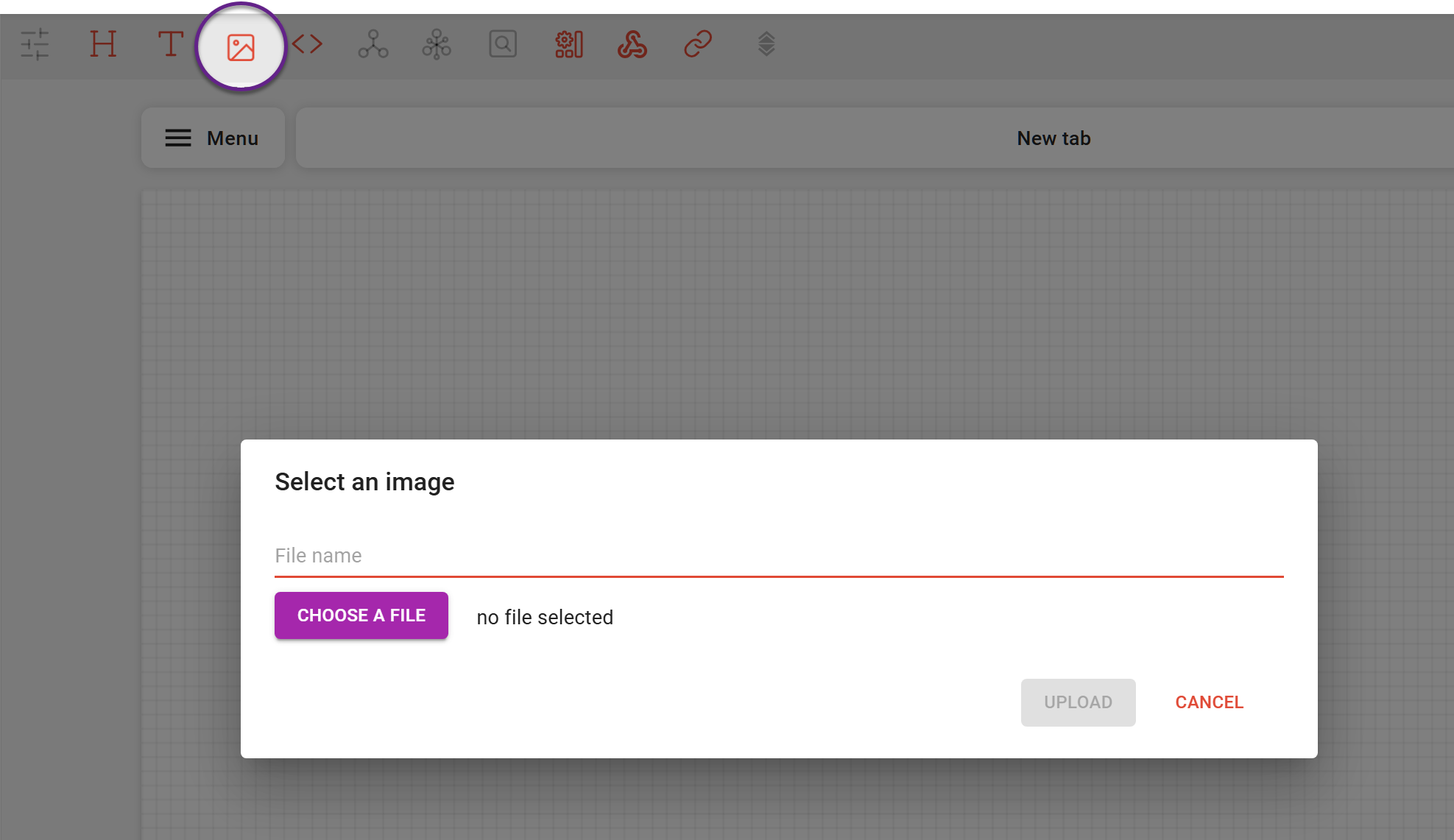
In EDIT mode, click on the 'image' icon 
A new widget containing the image appears on the dashboard. You can now resize and replace it on the dashboard.
Multiple files upload
To add multiple images, put them in a ZIP folder (up to 10 Mb) and upload them the same way as a single image. Even when uploading multiple files at once, only a single widget is created on the dashboard. You can then use tags to configure how images change within that widget. A detailed step-by-step guide is provided later in this article.
Images can also be displayed in a grid layout, where all images are visible at once. To enable this, change the Image bundle layout setting.
The grid layout has its own configuration options. In this article, we focus on the widget where images are displayed in a stacked layout.
Image bundle
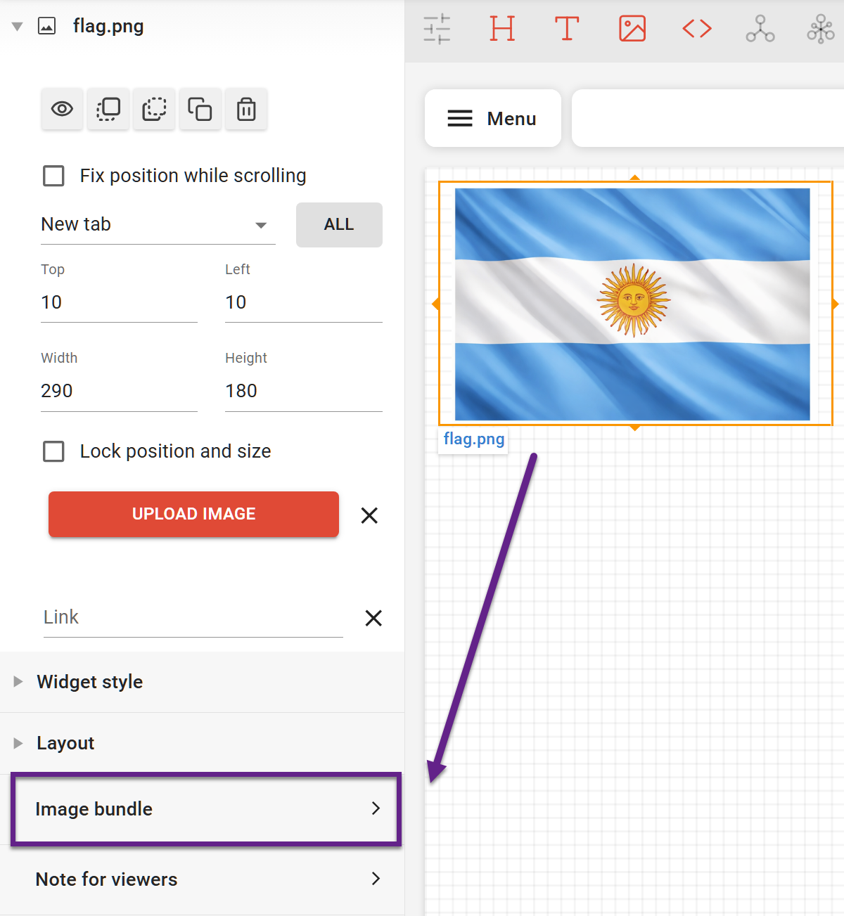
Once the image appears on the dashboard, selecting the image widget opens the Image bundle settings in the left-hand menu. In this section, you can add, replace, or remove images, perform uploads, and manage tags used for dynamic behavior.
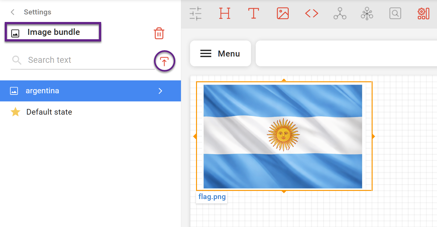
How to replace a single image
In the Image bundle section, select the picture you want to replace, click the 'Upload' icon, and load a replacement picture.
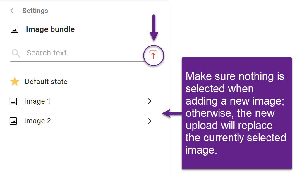
How to add images to the existing image bundle
In the Image bundle section, deselect the currently selected image (otherwise it will be replaced). Once no item is selected, click the upload icon to add a new image/video or a zip archive of no more than 10 MB.
Dynamic image switching
Tags
Images are linked to controls using tags. Each image can have one or more tags that must exactly match control options. When a specific control option is selected, the image with the corresponding tag is displayed.
Auto-tagging while uploading
Before uploading, you can organize images into folders. DataTile scans the entire folder structure and automatically applies tags during upload:
-
Folder names become tags
-
File names become tags
You can also define tags explicitly using hashtags (#) in file or folder names.
For example, an image named #lays#blue#chips.png will receive the tags lays, blue, and chips.
This tagging approach is especially useful for international tracking, where the same product may have different localized logos. In such cases, images with the same name can be stored in country-specific folders and uploaded together.
Tag matching is case-insensitive and space-tolerant. For example, 'Vector Cola' and 'vector cola ' in DataTile are treated as the same tag.
Managing tags afterloading
If tags were missed during upload or if you need to support a new control option, you can add tags manually.
To add tags manually:
-
Open the Image bundle section in the left-hand menu.
-
Select an image and click the arrow (>) button.
-
Enter a tag in the search field and click Enter.
-
If the widget is already linked to a control, the system will suggest matching tags during search.
Note: Existing tags can be removed but cannot be edited.
Linking an image widget to a control
After uploading, an image widget appears on the dashboard. To link it to controls:
-
Select the control.
-
Assign it to the image widget using the Tag option.
You can link the widget to multiple controls. In this case, image display is determined by the combination of selected control options.
If image tags do not match control option names, add new tags to ensure proper matching.
When assigning controls to an image widget, you must choose whether each control is required or optional. This setting is relevant only when two or more controls are assigned to a widget. If only one control is assigned, you can choose either option; it will not affect the behavior.
It determines whether each control’s condition is considered required or optional.
-
Required control: the image is displayed only if its tags match the selected option of this control.
-
Optional control: the image may still be displayed even if there is no matching tag for this control.
Example:
If an image widget is linked to two controls:
-
Both required: only images whose tags match the selected options of both controls will be shown.
-
One required, one optional: images that match the required control will be shown even if there is no match for the optional one.
Default state
You can define a Default state image. This image is displayed when:
-
No control options are selected, or
-
No image matches the current control state.
You can also dynamically adjust the arrangement of images in the grid using control.