
Assigning a control as ‘Mask’ is based on label matching. Masking works on the principle of only displaying what is selected in the control. However, as will be explained later, it is possible to implement the reverse logic as well. It's beneficial for emphasizing specific data points.
Assign as 'Mask':
Create a control that contains the categories you want to mask within your visualization.
Important: the option labels in the chart and control must match exactly. However, it doesn't matter what data the control is based on. This means you can place any options on the control and rename them. Masking will work even if you create a control with options from a different database – the core here is label matching.
While in EDIT mode, select the control and, in the command panel at the top of the widget, choose 'Mask' for Columns, Rows, or Split.
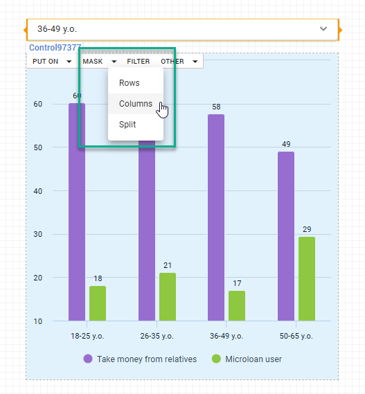
Once the control is set, when the dashboard is in VIEW mode, the 'Mask' interaction comes into play. It dynamically displays only the variables that a user selects within the control, providing a focused view that highlights the chosen aspects of your dataset.
Reversed masking / Anti-masking
In DataTile, you can set it up so that when a category is selected in the control, it gets hidden in the chart, essentially acting as reversed masking.
To apply category hiding
-
First, connect a control and a widget using the standard mask assignment method;
-
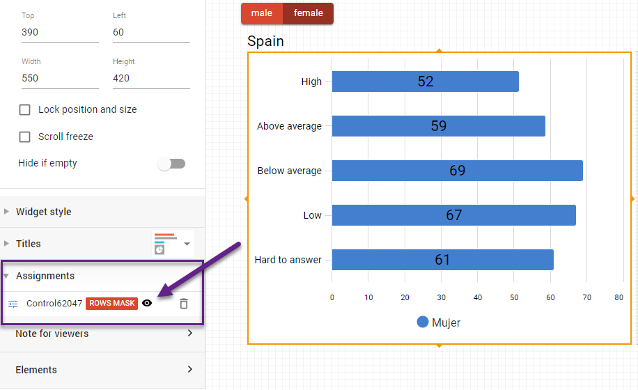
Click on the widget and go to assignments in the left-pane menu;
-
Change the ‘eye’ icon (next to the control’s title) status to ‘inactive’;
-
Switch to VIEW Mode to check if the hiding of options is correctly applied.
Mask example: focus on specific quarters in Financial Data
In a financial dashboard showcasing quarterly revenue figures over multiple years, you can highlight particular months or quarters without altering the underlying data as follows:
-
Create a control with the 'Waves/Quarters' variable.
-
Apply the control as 'Mask: Columns' to a line chart containing financial data in rows and 'Waves' in columns.
-
In VIEW mode, select the desired quarters to zoom in on, such as "Q2 2022" and "Q2 2023."
By using the ‘Mask: Columns’ interaction, the chart will display only the revenue data for the selected quarters, offering a focused view.
See the clip below for an example output of this chart:
-20230929-154033.gif?cb=4b2220499d7887f39a6a7081b790defa)