
The heatmap is a 2-dimensional data visualization technique. Color intensity encodes the magnitude, making it simple to spot hotspots, trends, and anomalies across the table. Heatmaps work especially well in large tables where scanning numeric entries alone can be tedious.
You can enable the heatmap in the menu panel in the DVI interface.
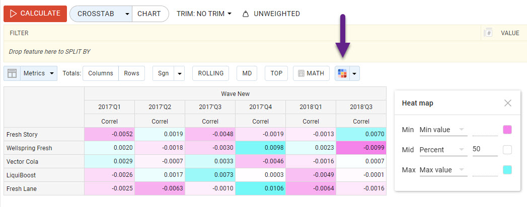
Heatmap Settings
When configuring a heatmap on a crosstab, you typically control three color-anchor points:
-
Min: The value mapped to the lowest color anchor (e.g., lightest shade);
-
Mid: The midpoint value, often representing an average or neutral benchmark;
-
Max: The value mapped to the highest color anchor (e.g., darkest shade).
By tweaking these anchors, you can adjust the distribution of the color gradient:
-
Symmetric scaling: set Min and Max equidistant from Mid to emphasize deviation from a central baseline.
-
Skewed scaling: shift Mid closer to Min or Max to expand contrast in a particular direction.
Values, Numbes, Percent
-
Use Numbers as static anchor values for consistency across multiple tables;
-
Use Min/Max Value as dynamic anchors for each run;
-
Use Percent as dynamic anchors when you want to colorize only a specific range (e.g., from 20% to 80%), while excluding extreme values.
Movable heatmap popup
The heatmap settings window can now be freely repositioned within the crosstab. It will remember its last position and reopen in the same spot next time.