
Dashboards using advanced visualization allow users to compare and track various data metrics at a glance, providing a cohesive view of key insights from multiple data sources, etc.
Take a look at how a dashboard is created using our BHT training dashboard as an example.
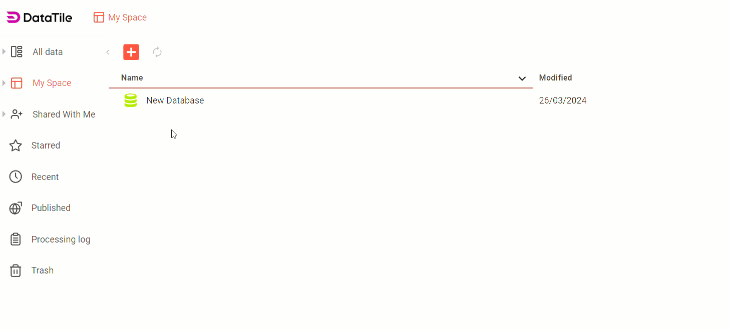
Step 1 | Create a blank dashboard
-
Go to My Space → Open/create a folder where the dashboard will be placed;
-
Click on the + sign and select Dashboard

-
Name a dashboard;
-
Click on the ‘Create’ button.
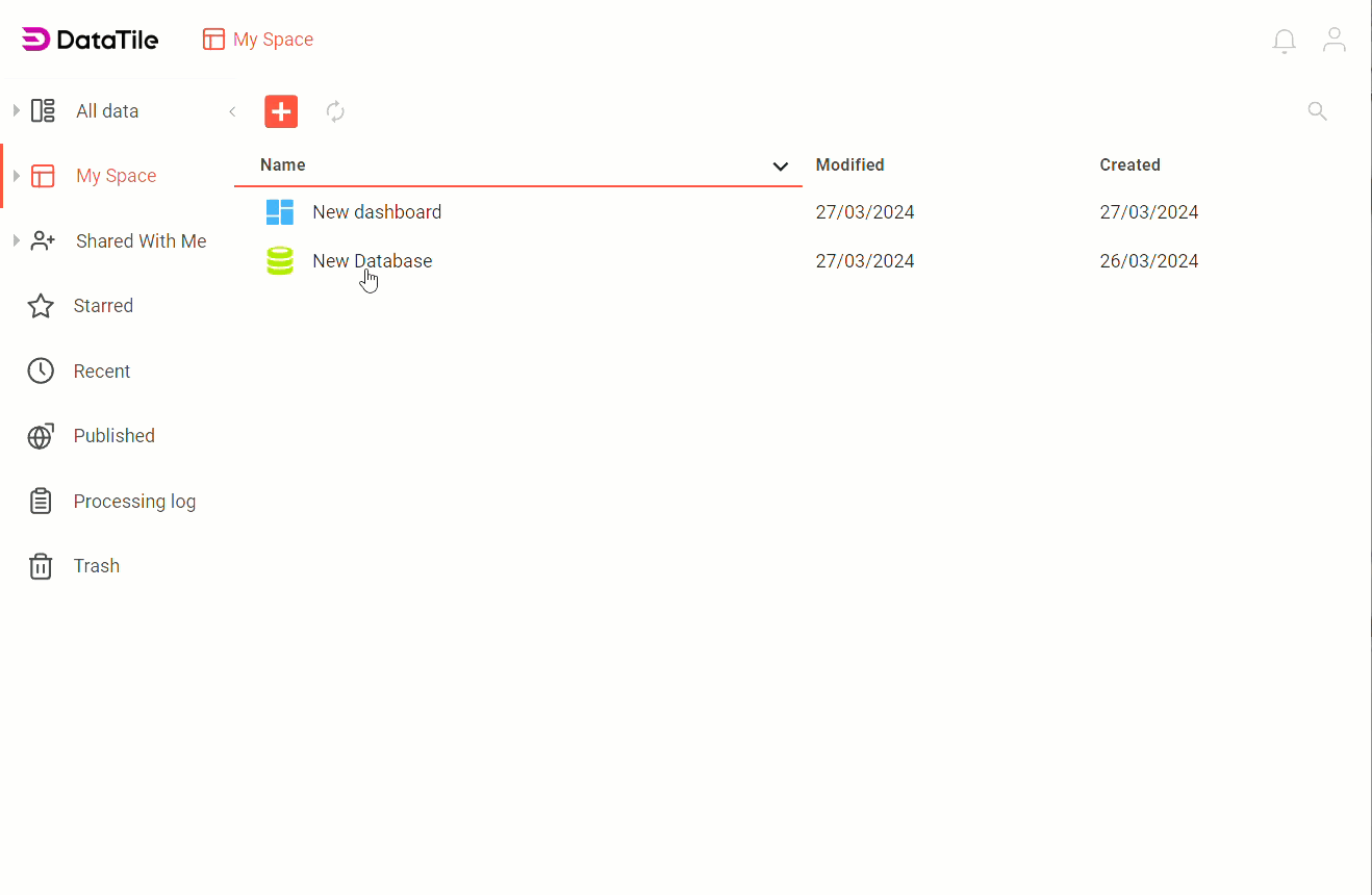
You can skip this step and create a dashboard during the chart or table export (step 2), but in that case, the dashboard will be saved in the default folder, which is the same as the database folder.
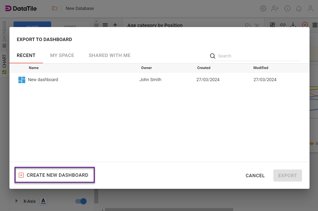
Step 2 | Export charts and graphs
-
Open a Database and create a crosstab/chart;
-
Click on Export to Dashboard

-
Select the newly created dashboard;
-
Click on the Export button.
-
In the pop-up window, you can click CREATE NEW DASHBOARD and export a chart to a new dashboard. The created dashboard will be placed in the same folder where the database is located.
Step 3 | VIEW vs EDIT mode
Our dashboards have two modes: VIEW and EDIT.
Dashboard design settings, widget configuration, and control creation are done in EDIT mode. Control testing and dashboard presentation are done in VIEW mode. All dashboards open in VIEW mode by default. Only those users who have EDIT rights can enter EDIT mode.
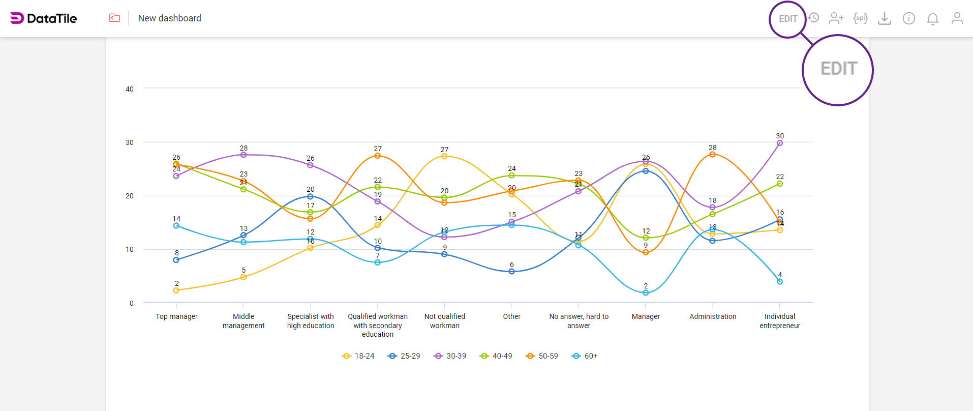
The screen below shows the widget in EDIT mode.
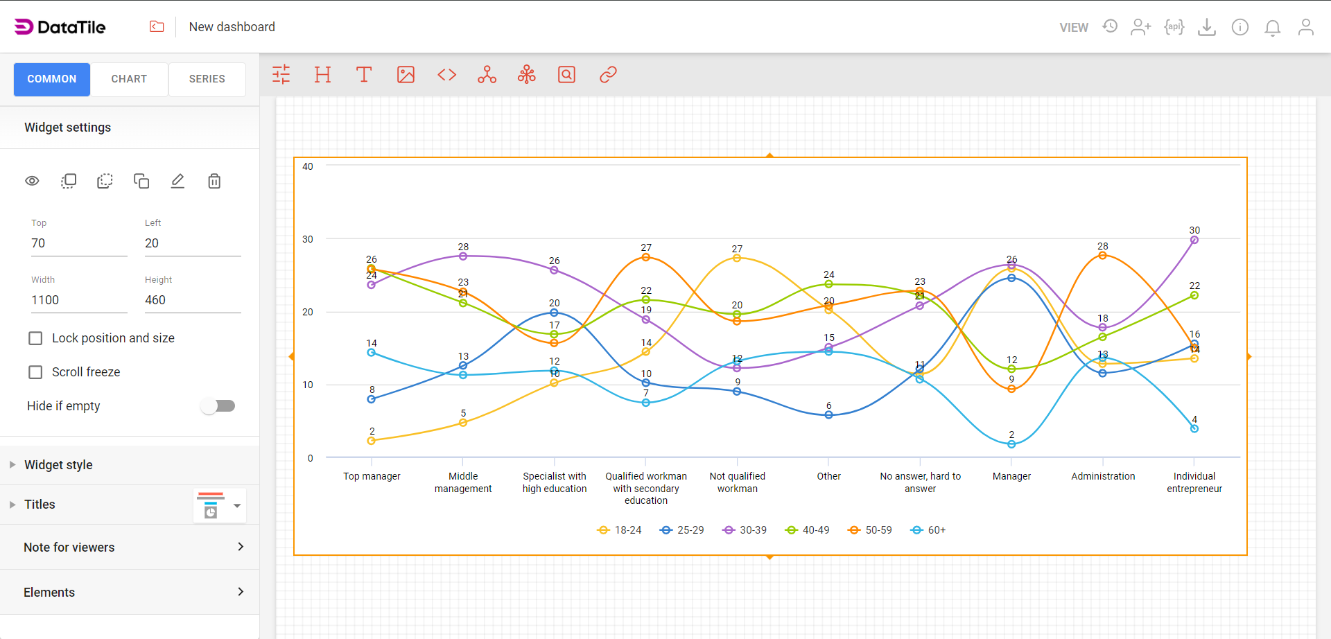
To switch between the modes click EDIT or VIEW in the toolbar. If it says VIEW then you are already in EDIT mode and vice versa.
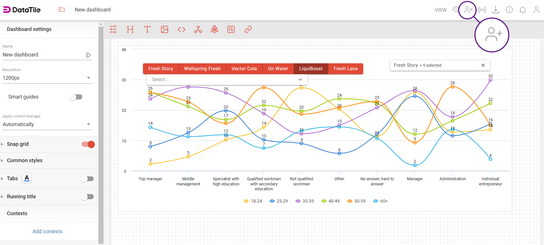
Step 4 | Create controls
Controls play a pivotal role in enhancing the interactivity of your dashboard - it is where you bring data to life. When you create a control, you create a ‘selector’, e.g., buttons, dropdown lists, tick boxes, etc. These allow your users to pick and view different audiences.
There are many types of controls you can create. In this step, we are going to show you how to make the two most frequently used types of controls:
-
Filter: it is an audience through which the whole chart or table is filtered. Examples of commonly used filters are gender, age, region, or income.
-
Put on columns or rows: allows you to substitute either the columns or rows of a table or chart with whichever variables are used in the control.
Step 4a | Creating a control as a filter
To create a control, click thе icon 
-
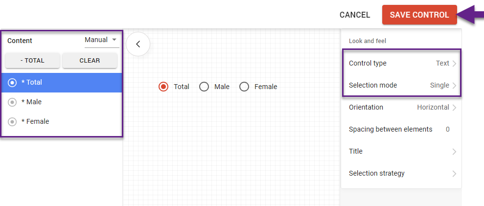
Find the ‘Gender’ variable in the codebook and drag and drop it in the box that says 'Drop Here'.
-
In the pop-up box choose ‘As list’.
-
Click the ‘+ Total’ button above to add a total category to the control (e.g. all genders).
-
In the ‘Look and feel’ section, expand and choose a control type. The default is a dropdown. For a simple control with only a few options, we suggest Buttons or Text.
-
In Selection Mode, select ‘Single’ so that the ‘Total’ is selected automatically.
-
Click the ‘Save control’ button.
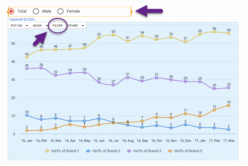
To assign a control to a widget (chart), first select it. A control bar will then appear at the top of all charts on the dashboard. On the chart you wish to link, select ‘Filter’.
Now repeat the same process for the ‘Age’ variable. Follow steps 1–6, but in step 5, select ‘Multiple excl. Total’ to filter the chart by multiple age categories simultaneously.
Read more on how to create controls.
Step 4b | Creating a control where you can choose which rows to show.
You can create a control that allows you to pick and choose which brands you want to see on a chart. First of all, click the ‘Create a new control’ icon.
-
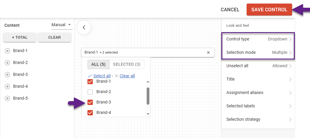
Drag and drop the ‘Top of mind’ variable to the 'Drop here' zone.
-
Click ‘As list’.
-
Let the control type stay ‘Dropdown’.
-
Change the selection mode to ‘Multiple’.
-
Tick the checkbox of each brand to switch them on.
-
Click Save Control.
While assigning this control to a chart, this time select Put on: Rows. This will populate the rows of the chart with the variables that are in the control.
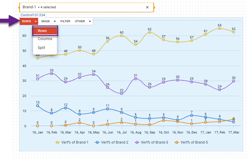
Switch to VIEW mode in the dashboard to see how you can select which ‘Top of mind’ brands you want to see on the chart live.
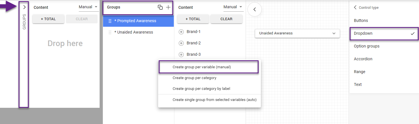
Step 4c | Creating your first control where you can change the rows (substitute) to other groups of rows.
There are three brand awareness questions in this database: top of mind, prompted awareness, and unaided awareness. This next step shows you how to take the control that you made in 4B a step further by adding multiple groups of brands that can be used to populate the rows of your chart.
-
Expand the ‘Groups’ pane in the control editor interface.
-
Drag and drop all three awareness questions (TOM, unaided & prompted) to the ‘Groups’ section.
-
Select Create group per variable (manual).
-
Let the control type stay ‘Dropdown’.
-
Change the selection mode to ‘Single’.
-
Click Save Control.
Remember to switch to VIEW mode if you want to see your controls in action.
You are not limited to awareness questions; you could have groups like websites, TV programmes, newspapers, or holiday destinations.
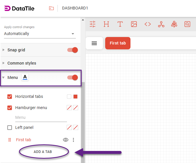
Step 5 | Dashboard Menu
You can create separate pages - tabs - on dashboards to avoid excessive scrolling. You can create an unlimited number of tabs on any dashboard. The tab hierarchy is organized as a dashboard menu.
You can choose 3 options for displaying the menu on dashboards (together or separately).
-
Horizontal tabs (all tabs are displayed above the dashboard);
-
Hamburger menu (tabs are hidden under the hamburger button and are accessed with a click);
-
Left panel (all tabs are displayed in the pane on the left of the dashboard).
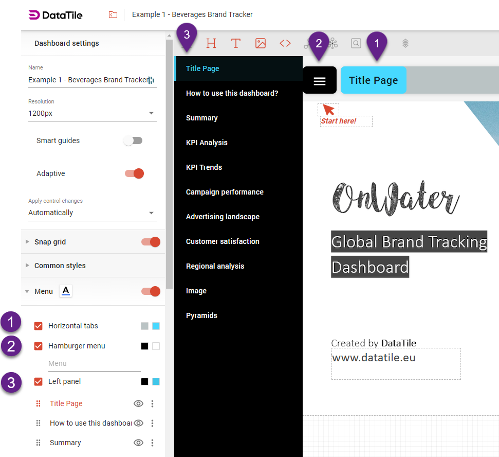
To add tabs: In EDIT mode, go to Dashboard settings → Menu → Add Tab. New tabs are automatically 'hidden', so you can finish your work before making them visible.
Step 6 | Share your dashboard
To share your new dashboard with other users or non-users, go to the top right-hand corner toolbar and select the Share icon.
In the pop-up screen, you have two different sharing options:
Invitation sharing and Public sharing.
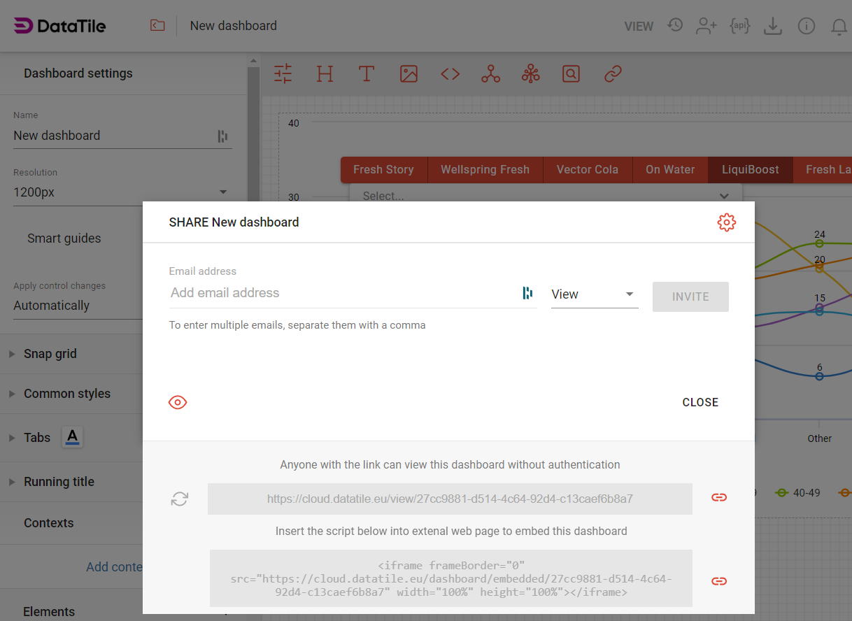
Invitation sharing is the most common method for sharing entities in DataTile. The dashboard owner maintains control over its users by granting them individual access. To share this way, enter the user's email address into the pop-up box, select their access level, and click ‘Invite’.
Public sharing allows you to share a dashboard via a public link, without requiring authentication. This means anyone with the link can access the dashboard in VIEW mode. Public links are ideal for openly publishing your data, such as on a website. If you need to secure your data and control access, it’s better to use invitation sharing.
Please, read this article to learn more about sharing entities like databases, charts, and dashboards or understand the different access levels and their associated rights.