
This article explains the basic tools needed to start creating DataTile charts. We offer a wide selection of charts and customization options so that you can always find the perfect way to visualize your data.
Switch to chart mode
Once you have created a crosstab table, click the CHART button to switch to chart mode. A default bar chart will be automatically created for you, which you can customize.
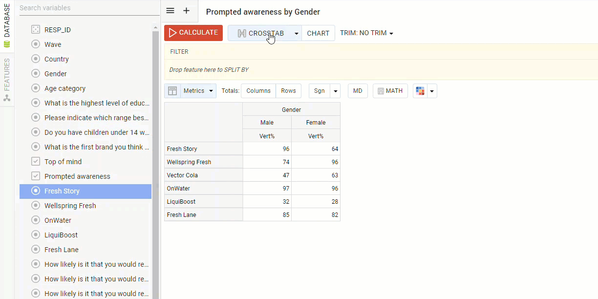
To go back to the table click the CROSSTAB button.
Customize your chart
Once in chart mode, you will see a chart customization panel on the left-hand side of the screen. All chart settings are placed on two tabs: Chart and Series.
The chart menu displays all general chart customization options, whereas the series menu contains options that specifically relate to the chart's data series.
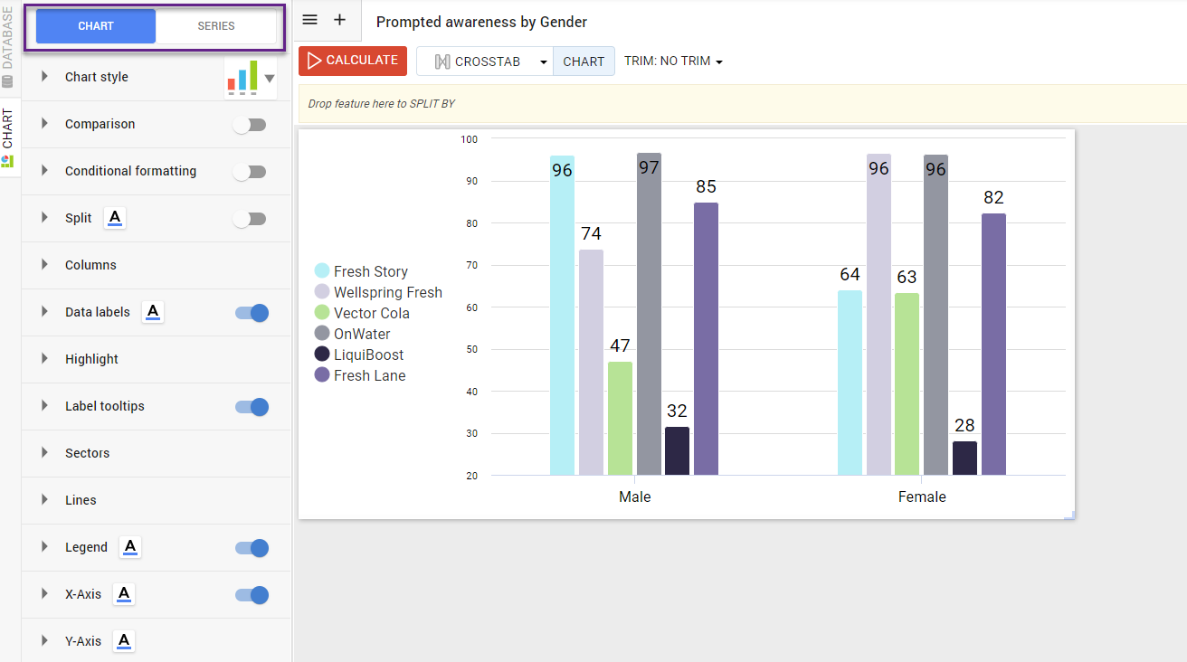
Chart style
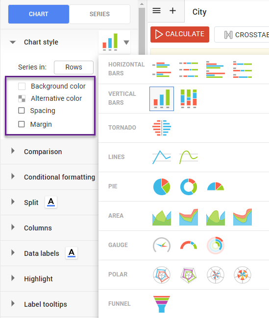
The default chart type is a bar chart, however, you can change the chart type easily by clicking the bar graph icon in the ‘chart style’ menu.
-
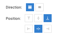
To change whether the rows or columns populate the series of the chart, click the button next to ‘Series in’.
-
To choose the background color of the chart, click the box and select a color. Likewise, you can choose an ‘alternative color’ as a secondary background color for your chart.
-
The spacing and margin allow you to set indents from the window edge to the chart content - tick the checkboxes and set a number in pixels.
Apply significance testing
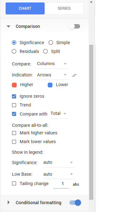
Expand the Comparison menu to apply significance testing to your chart. There are multiple options for comparison, with the most commonly used being Significance. You can alter the comparisons between columns or rows, or indicate the visual format of how you want the significant information to be flagged (for example; arrows or dots). Also, you can adjust the comparison legends.
Columns and Data labels
The column settings mostly define column widths, spacing, adding borders, and background colors. Try these options to find the best option for your chart.
If you switch on Data labels, you can customize the visual output of your data labels by selecting any of the following boxes: ‘Show data markers’, ‘Allow overlap labels’, or ‘Abbreviate thousands’. You can also define their position (horizontal and vertical alignment) using the icons below.
To add a % or another metric to the end of your data labels, simply type it into the box underneath ‘Value suffix’ and click Enter.
To alter the text view of Data Labels (as well as any other text elements) select the Font edit icon ![]()
Legend, X-axis & Y-axis
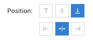
Customize the visual output of the Legend by selecting the following boxes: ‘Show legend only’, ‘Legend in reverse order’, or ‘Width’. To define the position (horizontal and vertical alignment) or direction of your data labels select from the icons below.
For the X-axis following boxes to customize the visibility or parameters are available: Images, Labels, Margin, Custom label step, Hide line, Notches, Omit zeros. Also, you can adjust label slops here.
For Y-axis adjustment of margins and abbreviation thousands are available on the CHART tab. More y-axis settings are under the SERIES menu.
Customize your chart: Series Menu
To view the Series menu of the chart customization panel select the SERIES tab. This is where you can edit the visualization of your charts Series, Y AXIS, and add layers or levels.
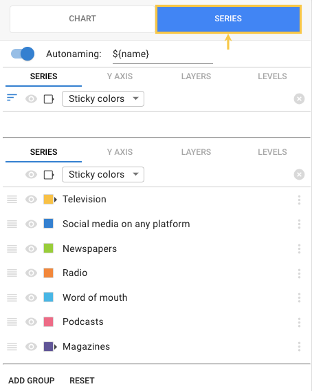
In the initial series menu, you can choose to hide variables, move their position, or change their colors. To change their colors click on the color icon next to each variable and either type in a new Hex code or select another from the color palette. You can also choose a color regime as a general strategy within a database.
If you have turned Data Labels on in the CHART menu you may now have a double y-axis. You can switch off the y-axis by clicking on Y AXIS then deselect the checkbox next to Visible.
Download, Export, or Share your chart
When you finished with all settings, to download your chart as PowerPoint, PDF, Excel, PNG, or JPEG Image, click the icon ![]()
You can also export your chart to a new or existing dashboard by clicking the ‘Export to dashboard’ icon ![]()
Here is the detailed article on how to share the charts as independent entities.