
This guide provides a comprehensive overview of a crosstab in DataTile, offering first-time users a step-by-step exploration of the interface and functionalities. Let’s dive in.
The Crosstab Interface - Data Visualization Interface (DVI)
The crosstab interface, or DVI, is the main screen for building tables in DataTile. The image below highlights some key crosstab functionality areas essential for new users. Each of these areas will be explored in greater detail within this guide.
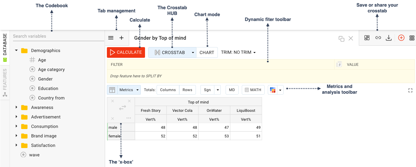
The Variable Tree (Codebook)
The variable tree in the left part of the crosstab interface contains all variables from . The codebook is created when loading the database and can be modified in the Meta-Editor. All changes in the codebook - renaming, creating MR-sets and logical variables, etc. - affect the variable tree. But if you make any changes when working with variables in crosstab, these changes will remain only for the query and will not affect the codebook.
Clicking on any variable will open an additional panel with its options.
To learn more about the different variable types click here.
Build your first crosstab
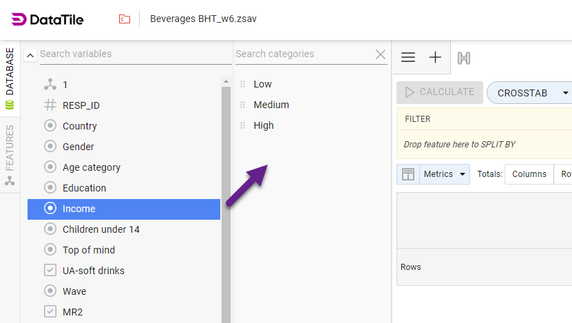
To build a table, drag and drop variables/options directly from the codebook onto the columns or rows of your table. To select more than one element you can hold down the CMD (Mac) or CTRL (Windows) keys.
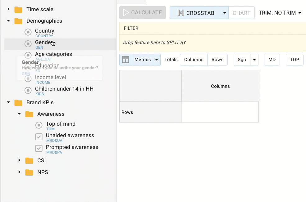
As you can see in the video above, when you drop a variable onto the grid or table you are presented with various options which tell the software how you want your data to be inserted. Once you have selected the right option, click CALCULATE to view the data.
The most commonly used options are:
As List - Insert the categories in a list format;
OR-Join - Group together people who answered ‘yes’ to any of the selected answers. For example, if you input the age categories ‘30-39’ and '40-49, anyone who answered yes to either of these will be included.
AND-Join - Group together people who answered ‘yes’ to both of the selected answers. For example, if you input ‘Men' and ‘30-39’, anyone who answered yes to both of these will be included.
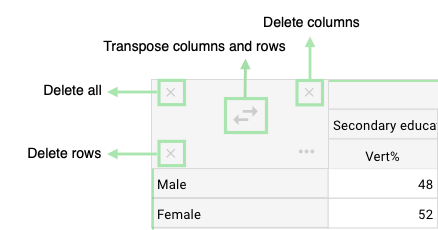
AND-Join as group - This should be used when you select more than one code to join an existing code (e.g. variables already in the table). The selected codes are OR’d together within brackets, before being AND’ed with the existing variables. For example, imagine you already have the ‘Men' variable in the rows of your table. If you select the age categories ‘30-39’ and ‘40-49’, and select And-Join as Group, the resulting variable would be ‘Men’ who are either ‘30-39’ OR ‘40-49’. In logical terms, it would be expressed as “Men AND (30-39 OR 40-49). Delete columns or rows ( the 'x-box')
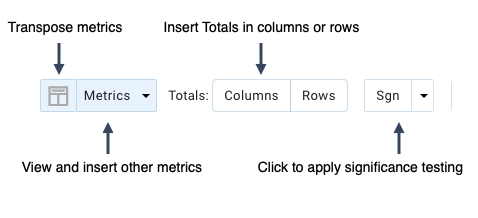
To view different actions for the table hover your mouse over the ‘x-box’. You can delete selected columns, rows, or both, or transpose your columns and rows.
Dynamic Filter Toolbar
The Dynamic Filter toolbar is another space where you can drop variables, adding a third element or base to your analysis.
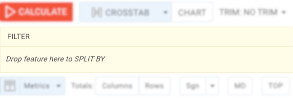
Filter - This acts as a base, letting you narrow down the data based on specific criteria, such as a particular audience or wave of data. The default is all.
Split - This acts as a sub-base where you can add another dimension to your table. For example, if you drop the Regions onto the Split bar, you can toggle between each region and analyze the data simultaneously without needing to redo the table each time. Export to Excel will report each split.
Metrics and Analysis Toolbar
The DVI toolbar contains various other features that can aid the analysis of your data. The different buttons that appear here are determined by the database settings.
Vertical % is the default metric used in crosstab. Thus, if you drop several options onto an empty table, the first result displayed will be the frequency expressed as a percentage.
Save or share your crosstab
In the top-right toolbar, you can find three icons that help you to save or to share your crosstab.
-
First of all, you can export the table to a dashboard, using the ‘Export to dashboard' icon.
-
Secondly, you can provide quick access to your crosstab for colleagues (who also have access to DataTile) using a shortcut link. You get the link by clicking on the ‘Shortcut’ icon.
-
And finally, you can download the table to PowerPoint, PDF, Excel, or as a PNG or JPEG image. Click on the ‘Download as’ icon and select the option from the submenu.
Additional Information
The Crosstab HUB
The Crosstab hub has three different modes of analysis; Crosstab, Grid Request, and Raw Data.
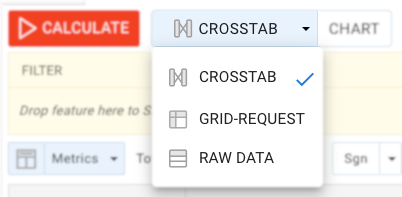
Crosstab is the default mode of analysis and is characterized by building tables that show you how your variables interact, and provide information about how subgroups responded to your survey.
Grid Report mode empowers you to perform side-by-side analysis of different answers to the same question, such as a likert scale question. Click here to learn more.
Raw Data mode enables you to analyze open-ended text questions.
Tab management
In DataTile, you can save and work on multiple crosstab runs at once. The tabs feature is useful if you want to analyze multiple runs simultaneously, refer back to previous calculations, or just save and view them later.

Create a new tab by clicking the ‘+' icon in the left corner of the tab management toolbar. To view and open your other tabs, click the hamburger icon '☰’.
On the right-hand side of the toolbar, click the 'clone' icon ![]()
Tabs are automatically named based on the information in your crosstab, however, you can rename them by double-clicking on the header.