This article explains how to configure custom control colors that differ from the brand colors and menu colors. You can customise control color schemes both for the entire dashboard and individually, either to emphasise a specific control or to complement controls with a background color.
Common styles: Primary and Secondary colors
In addition to the default colours, one way to customise dashboard controls is through the dashboard common style. In this case, all controls use the same colour scheme.
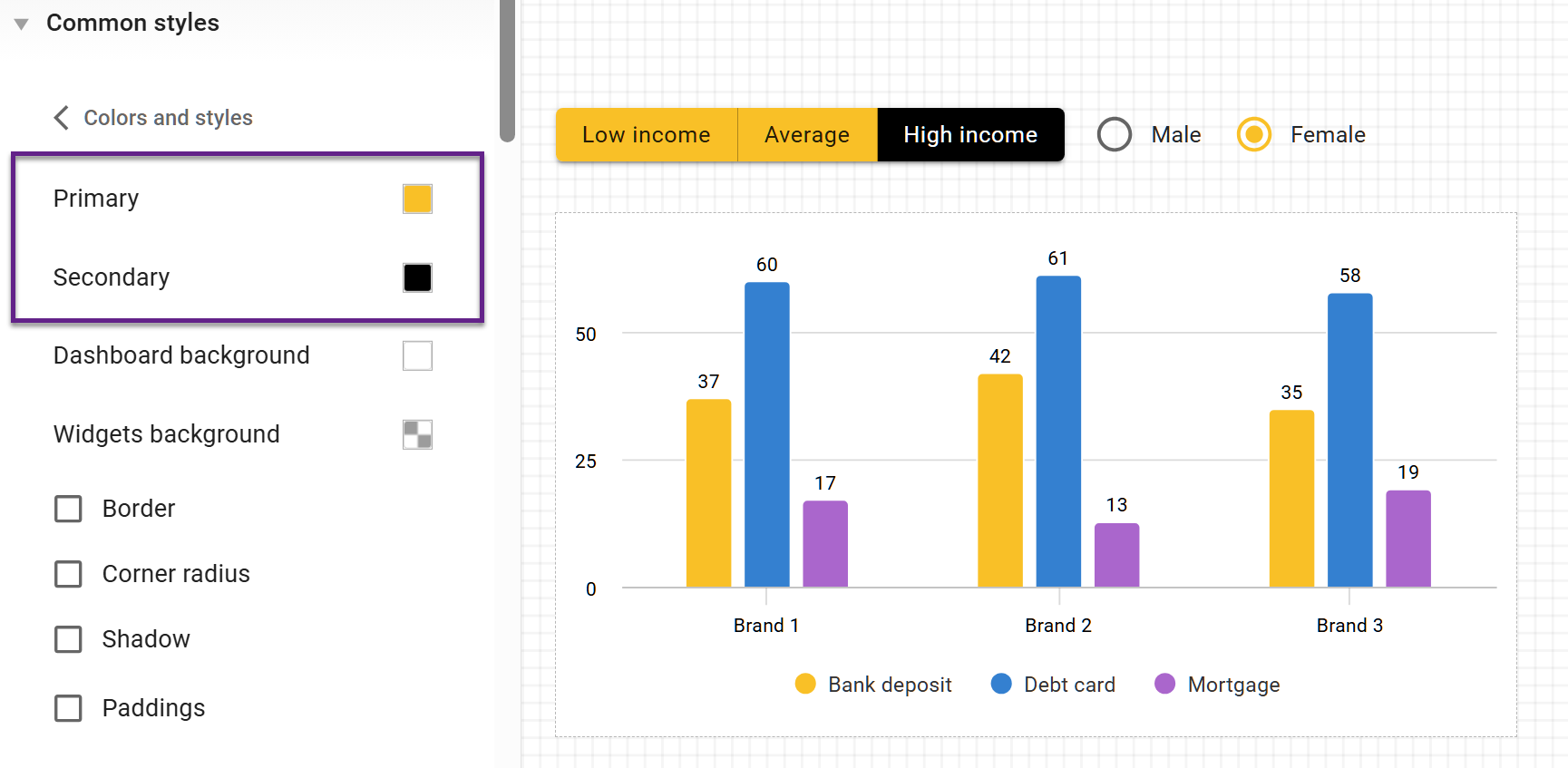
These settings are configured in the Common styles section for the entire dashboard: Common styles → Colors and styles → Primary and Secondary colors.
By setting these colors, you define how active control options are displayed. For most controls, the active option is highlighted with the Primary colour. The exception is the Button control, which uses both colours at the same time: for button controls, the Primary colour defines inactive options, while the Secondary colour defines selected options.
Individual customization
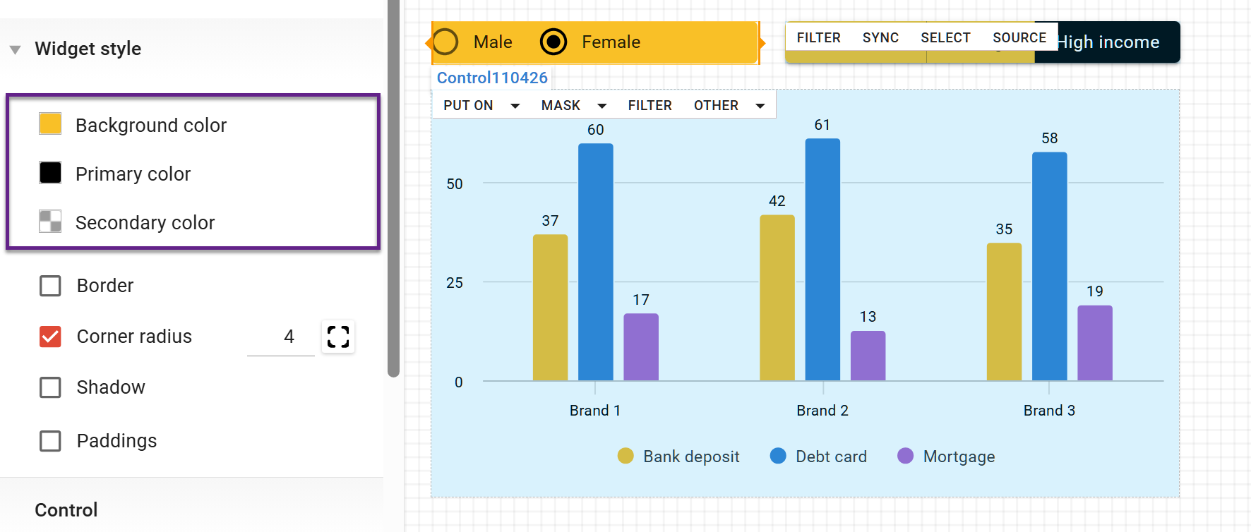
Controls can also be colored individually by using the widget color settings. To do this, select the control and use the Widget Style menu to configure the following colors:
-
Background color.
-
Primary colour (indicates selected options in all controls except the button control, where it indicates non-selected options).
-
Secondary colour (indicates selected options in the button control).